
Explore our creative showcase and discover how we bring visions to life. Each image tells a story of creativity and collaboration.
Elegant and refined branding for a boutique skincare brand, featuring custom gold gradients, botanical accents, and a warm, minimal identity designed to express natural luxury and feminine confidence.
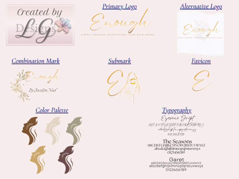
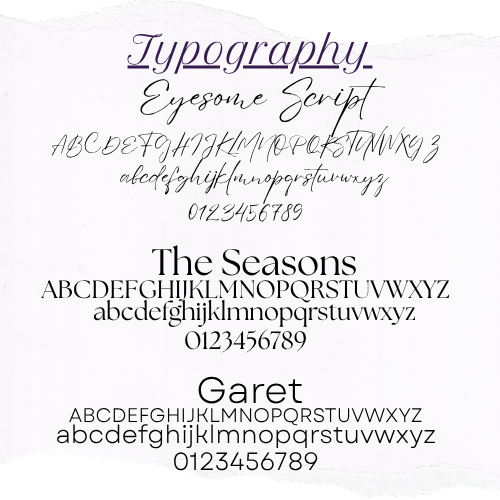
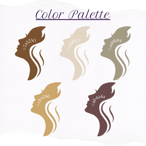
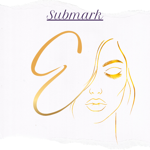
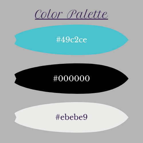
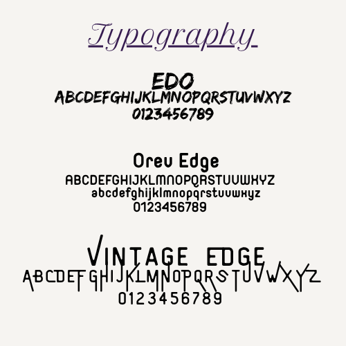
This branding package for Enough captures the essence of clean beauty, natural luxury, and feminine elegance. Designed with soft gold gradients, botanical details, and warm earth-tone color harmonies, the visual identity reflects the brand’s mission: Simply Enough. Everything your skin needs.
From logo variations and typography styling to the custom color palette, submark, favicon, and final brand board, every piece was crafted with intention. The result is a cohesive brand system that feels elevated, nurturing, and timeless—perfect for a boutique skincare line rooted in purity and purpose.
Professional and trustworthy branding package for Paulin Moving Co.
A modern, family-oriented identity featuring clean design, cohesive color palette, and polished logo suite created to elevate their local moving brand.
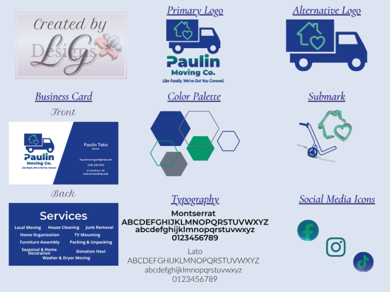
This complete branding suite was designed for Paulin Moving Co., a family-owned moving business based in Greensboro, NC. The goal was to create a clean, trustworthy, and professional identity that reflects their core values—honesty, care, and hard work.
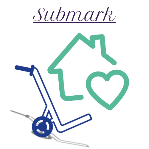
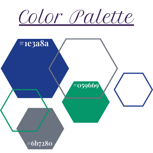
The visual identity includes a primary logo, alternate logo, submark, color palette, typography system, business cards, and social media icons. A bold navy blue and soothing teal palette conveys dependability and warmth, while modern typography and geometric shapes create a professional yet approachable brand presence.
Every element was designed to strengthen recognition and consistency across both print and digital platforms, helping Paulin Moving Co. stand out as a reliable local service provider that treats clients like family.
A bold and surf-inspired brand identity designed for Driftline Co. — a lifestyle brand built for motion and purpose. This package includes a dynamic logo suite, modern font, and a fresh turquoise palette that captures the energy of the ocean and the confidence of the brand.
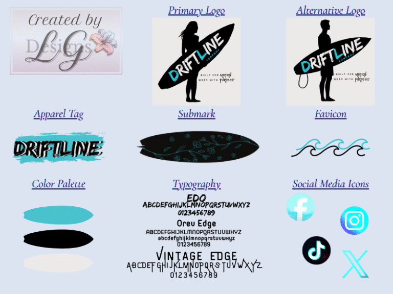
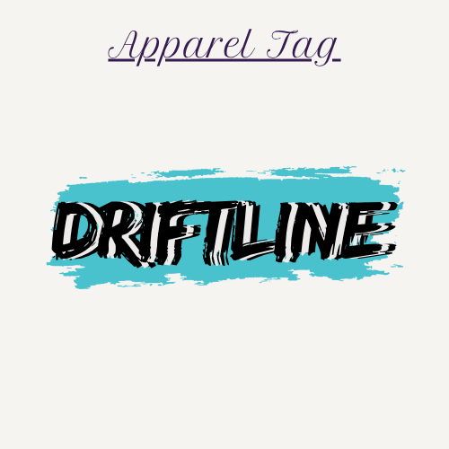
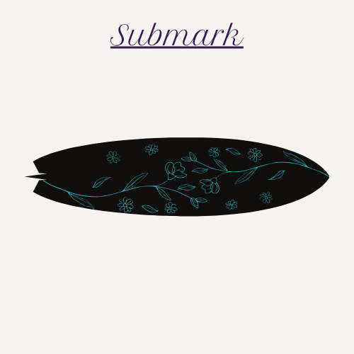
Driftline Co. is a surf-inspired lifestyle brand built for motion and worn with purpose. This branding package captures the brand’s adventurous, coastal essence through a bold yet modern design system. With a mix of sleek typography, a crisp turquoise-and-black palette, and fluid wave motifs, the brand reflects both freedom and direction — perfect for a company rooted in surf culture and self-expression.
From the logo and apparel tag to the social media icons and typography suite, every element was intentionally crafted to balance energy with clarity. The design evokes a sense of flow, confidence, and individuality, appealing to those who live by the rhythm of the tide.
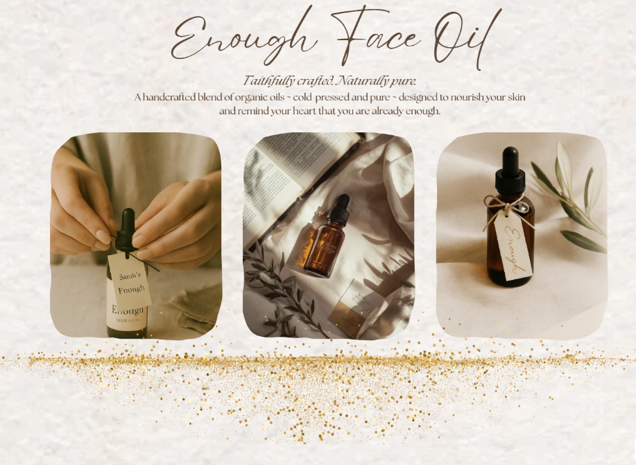
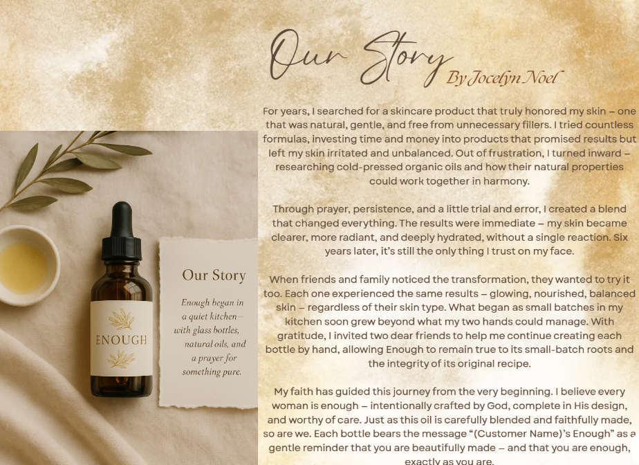
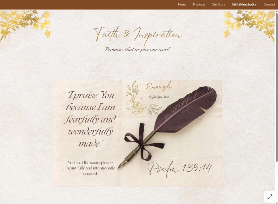
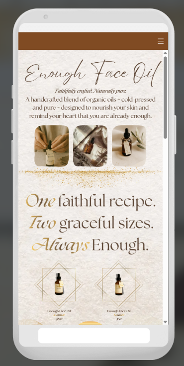
The Enough by Jocelyn Noel website was crafted to embody serenity, purpose, and refined modern beauty. This custom-built site blends gentle neutrals, elegant typography, and meaningful storytelling to present the brand’s handcrafted skincare in a warm, intentional way.
Every section—from the product gallery to the “Our Story” page—was thoughtfully designed to support a brand rooted in simplicity, faith, and self-care. The site features a fully responsive design, clean product presentation, a gentle spiritual undertone, and custom-written content aligned with the brand’s message: Simply Enough. Everything your skin needs.
Throughout the project, I worked closely with the owner to maintain her authentic voice, ensuring that every detail—visual, functional, and emotional—aligned with her mission. From desktop layouts to mobile refinement, each page reflects a seamless user experience rooted in elegance, clarity, and purpose.
This project also included custom animations, personalized product mockups, mobile-first optimization, and content structuring tailored to the client’s unique handmade product collection.
Lead-generating website designed for a 30-year promotional marketing company.
Features include custom animations, branded icons, and catalog search integration—created in close collaboration with the client for a seamless experience.
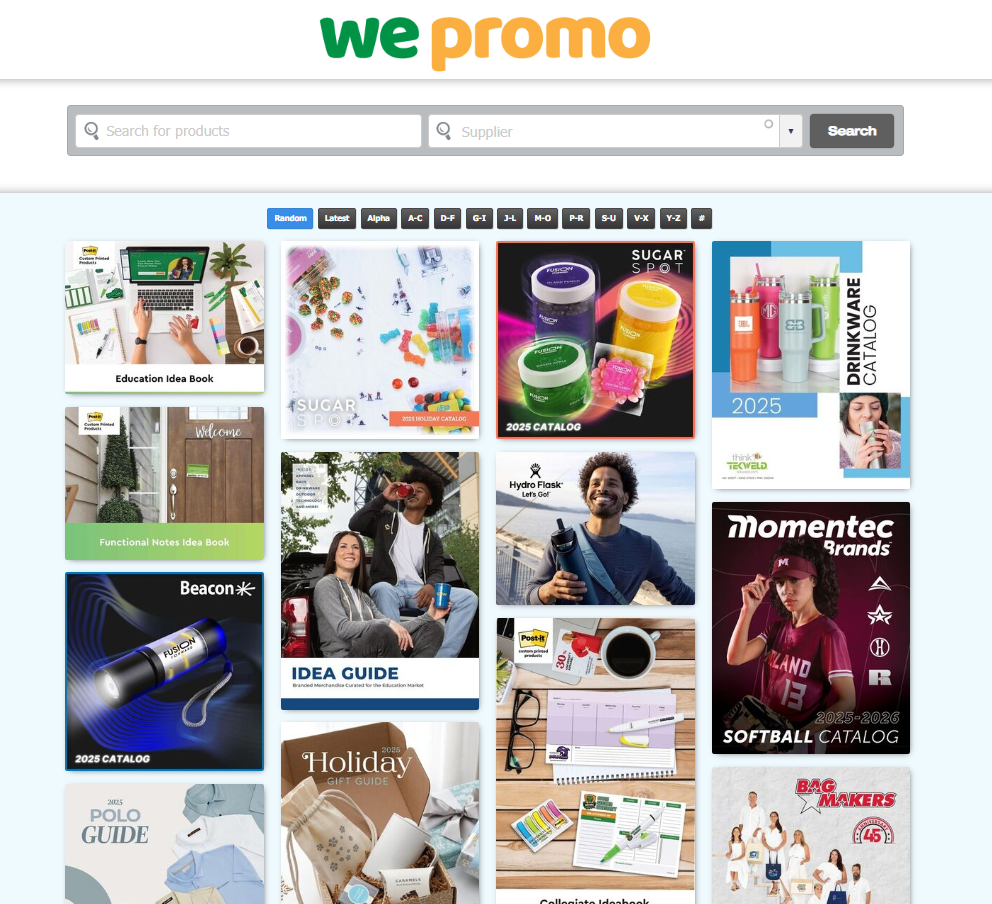
This project was a collaborative website design created for Ripley’s Advertising Answers, a North Carolina–based promotional marketing company celebrating over 30 years in business. The goal was to craft a clean, functional, and engaging online experience that would both generate new client leads and allow customers to easily search and explore product catalogs from partnered suppliers.
Working closely with the client, we developed a layout that balances usability with personality—blending classic design structure with thoughtful creative details. The site features custom icons, branded animations, and original content that reflect the company’s long-standing reputation for creativity and customer service.
While the project utilized the client’s preferred third-party hosting platform—known for its structured, legacy framework—we worked flexibly within those limitations to modernize the interface and optimize user experience. Through clear communication and a collaborative approach, we delivered a design that not only highlights Ripley’s professionalism but also demonstrates how intentional design can thrive even within a restrictive environment.
This project showcases the ability to adapt to unique platforms, problem-solve creatively, and deliver cohesive design solutions that honor both client goals and brand vision.
Noctivibe captures the rhythm of city nights through sleek design, gradient typography, and bold creative energy.
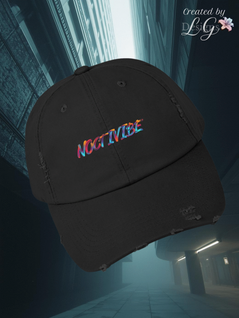
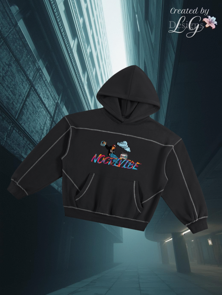
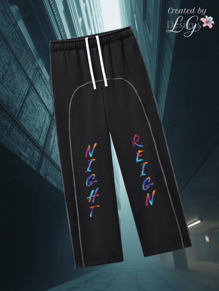
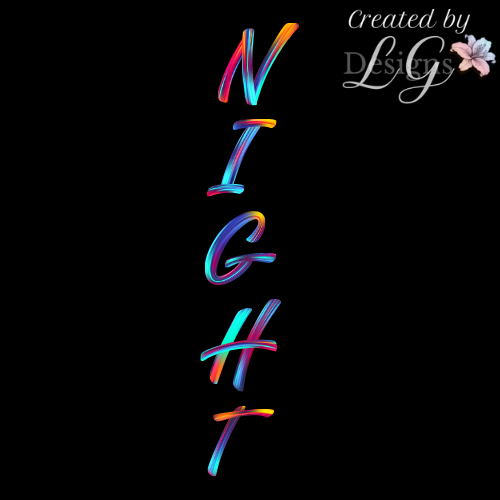
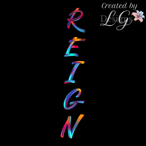
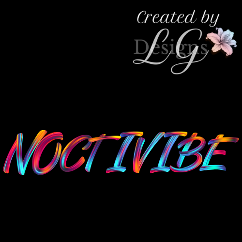
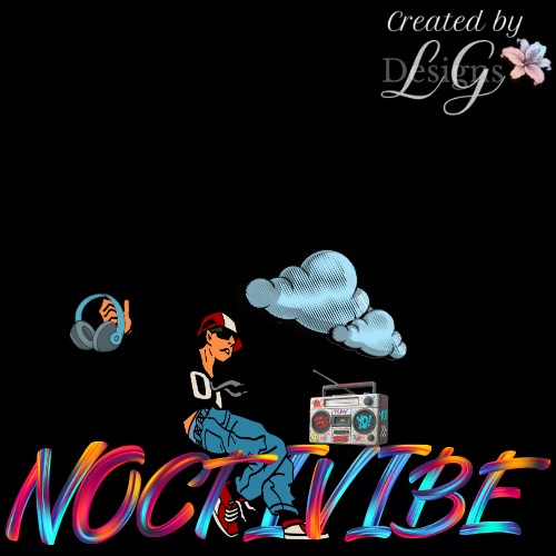
The Noctivibe project captures the pulse of nighttime energy — bold, sleek, and unapologetically expressive. This custom apparel set was designed to embody the rhythm of the city after dark, where creativity thrives under neon lights and individuality reigns supreme.
Each piece blends comfort with statement design: a distressed cap, oversized hoodie, and joggers unified by vibrant holographic typography and clean stitching details. The phrase “Night Reign” anchors the collection’s identity — a powerful two-word mantra that reflects confidence, motion, and the art of owning your moment.
Infused with layered gradients, dynamic lettering, and minimalist forms, this collection merges streetwear attitude with a polished creative edge — a visual celebration of those who rule the night with style and purpose.
A custom apparel collection created for the Young Adult Bible Society — blending college-inspired design with meaningful Christian symbolism. Each piece celebrates unity, faith, and fellowship through thoughtful design details and modern style.
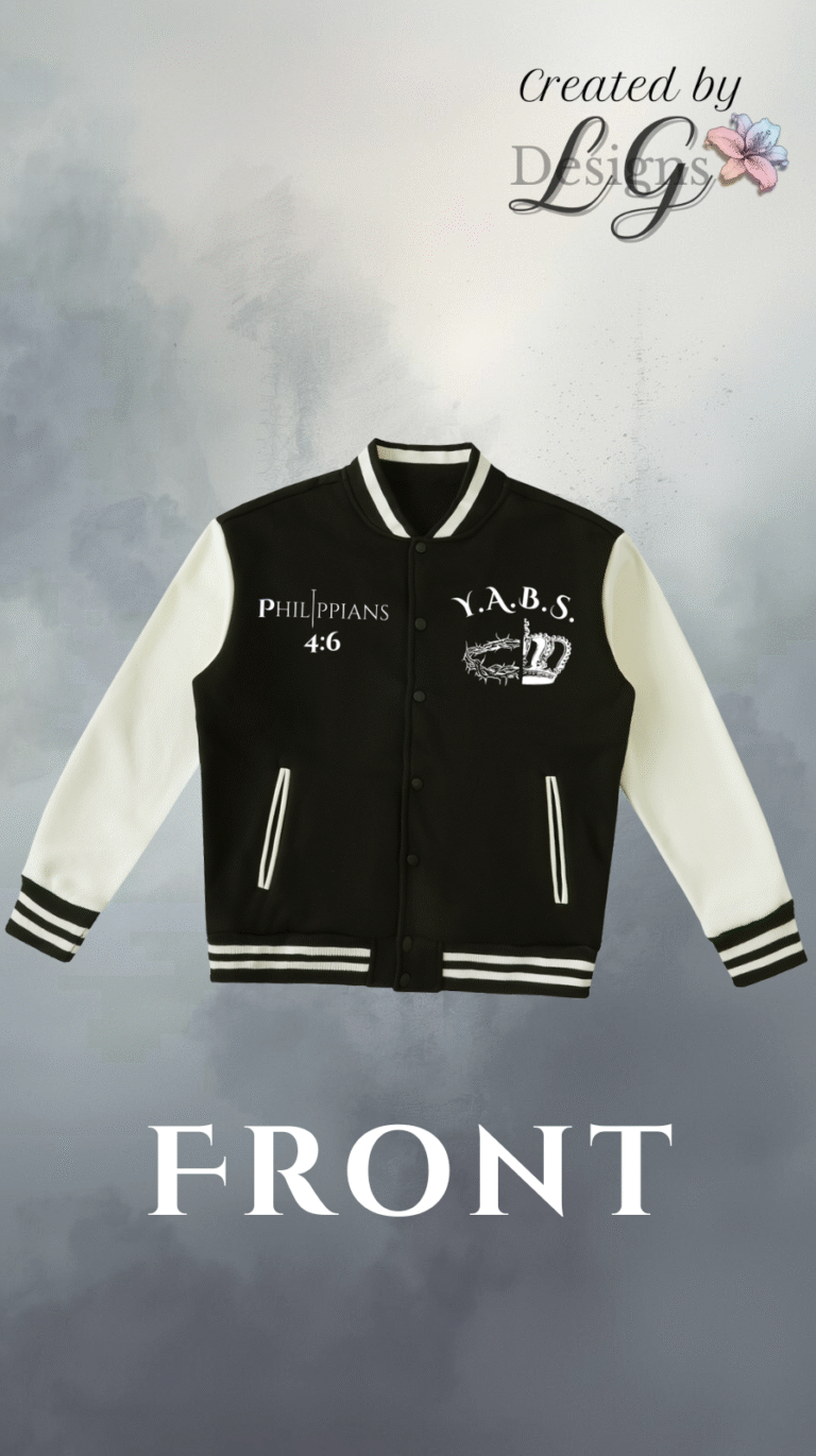
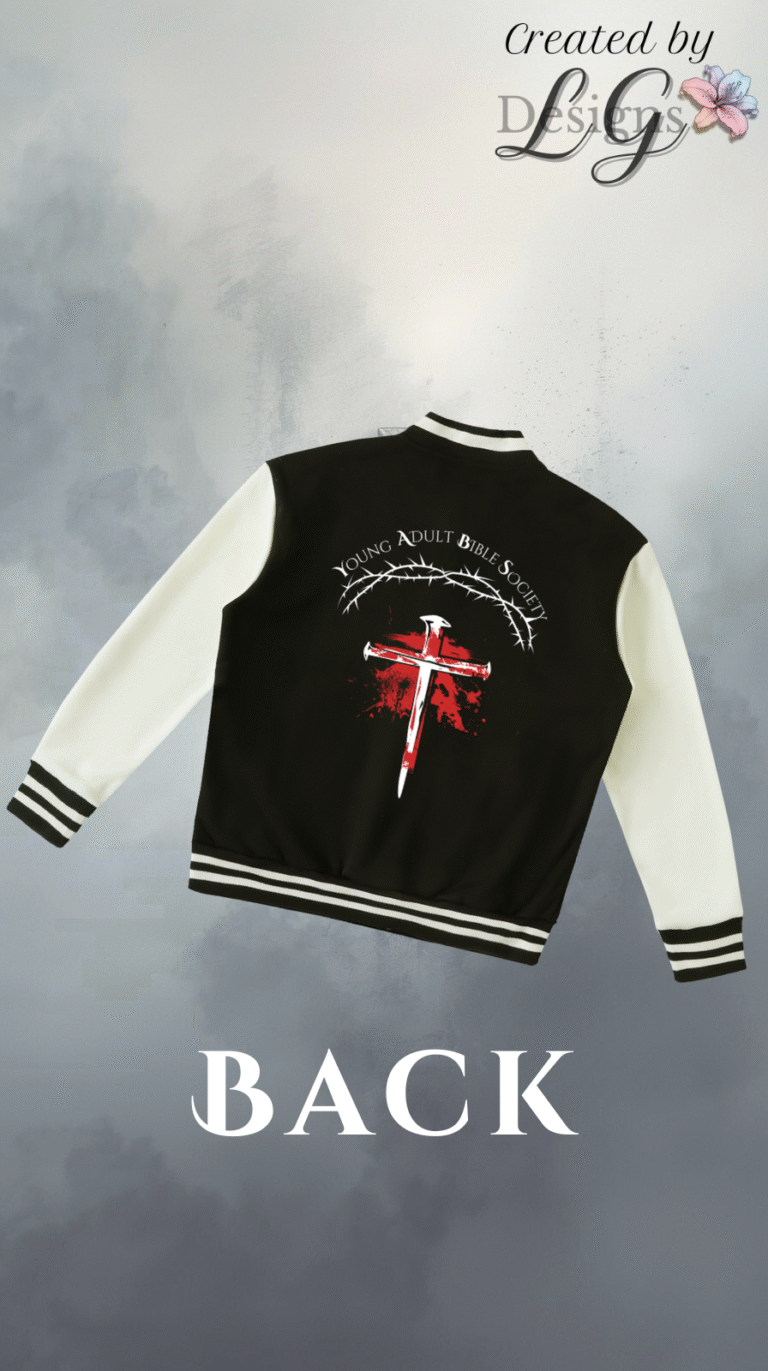
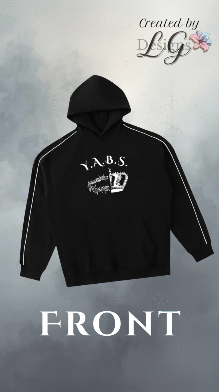
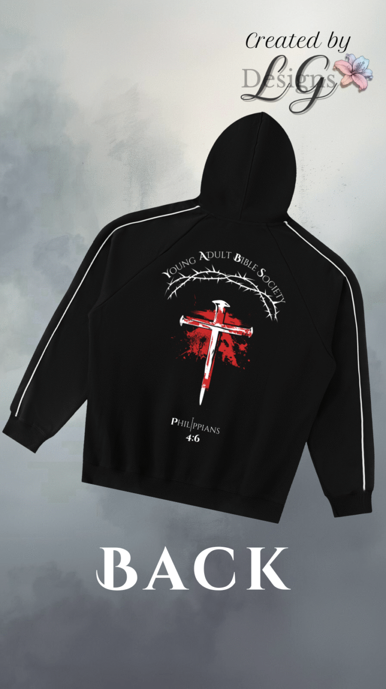
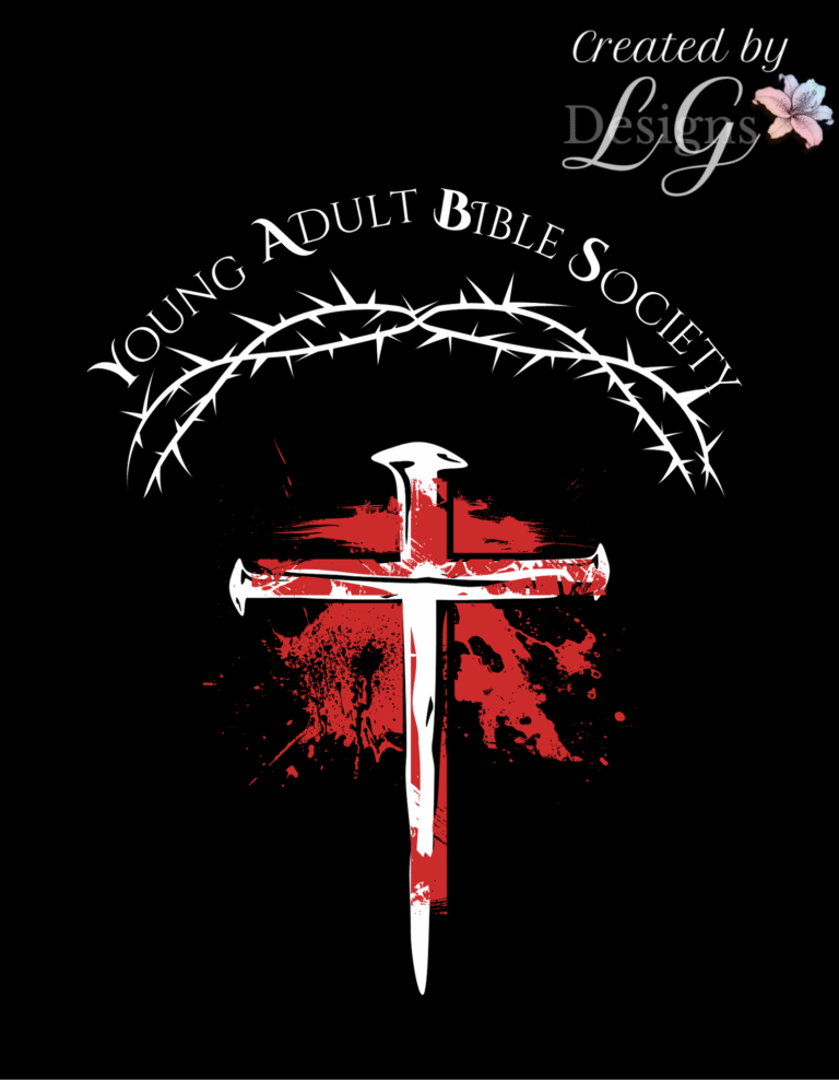
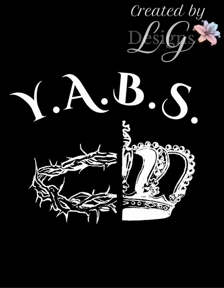
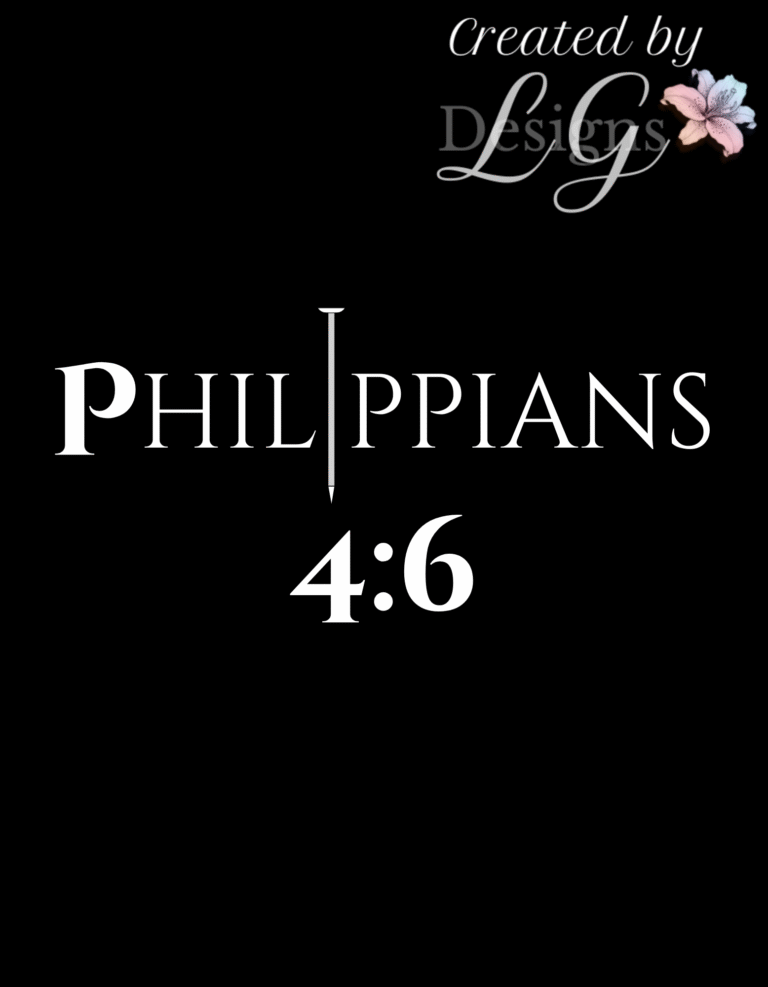
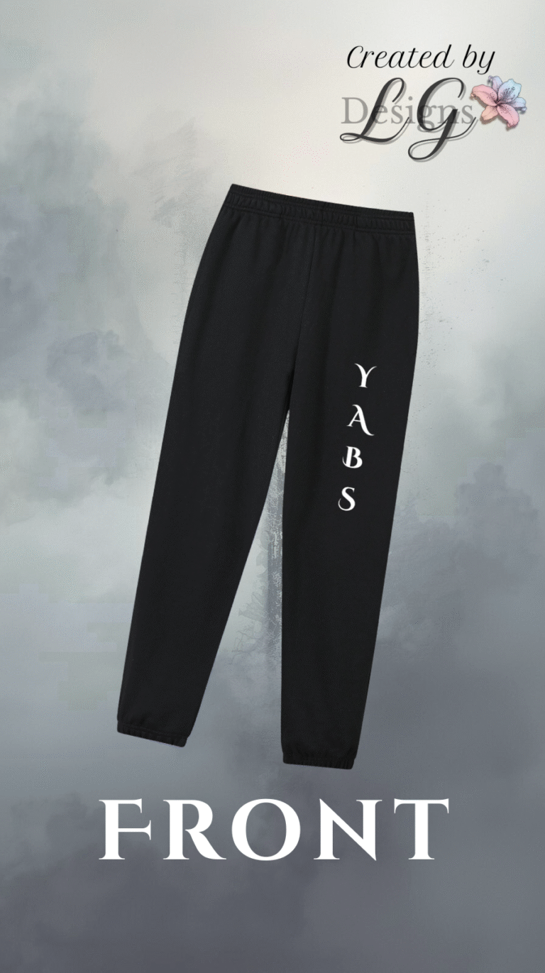
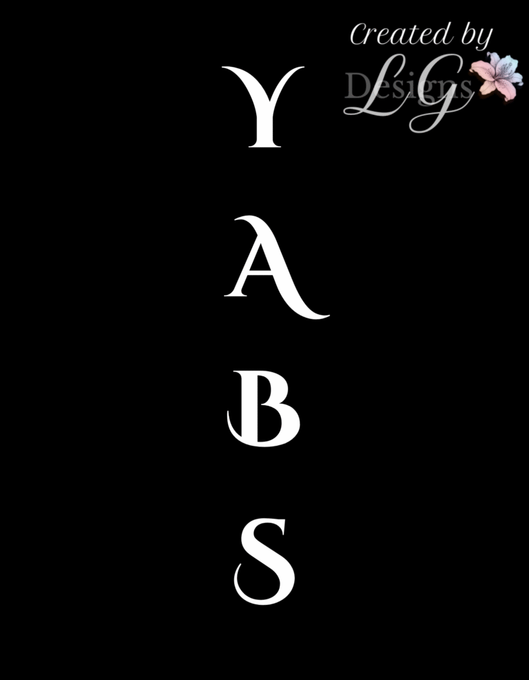
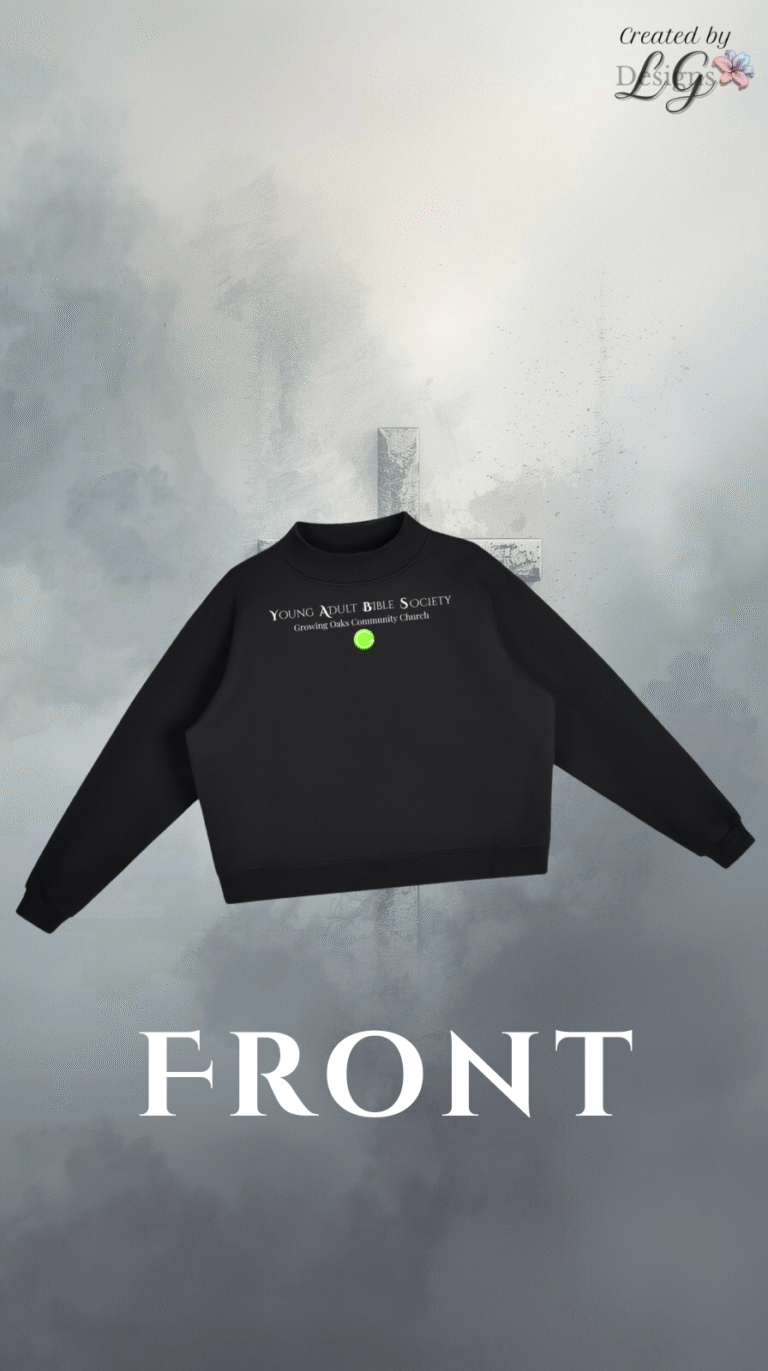
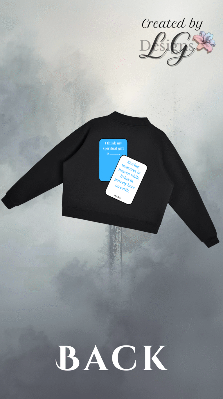
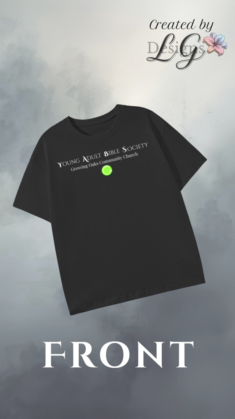
This custom apparel collection was created for the Young Adult Bible Society (Y.A.B.S.) — a faith-driven organization based at Growing Oaks Community Church. The collection blends modern streetwear with collegiate inspiration, designed to unify the group with timeless style and meaningful symbolism.
Each piece tells a story. The featured hoodie, sweatshirt, joggers, and letterman jacket highlight faith-based elements — including the verse Philippians 4:6 and a striking cross-and-crown motif symbolizing perseverance and devotion.
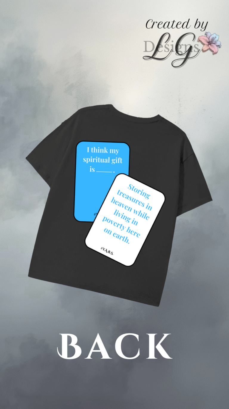
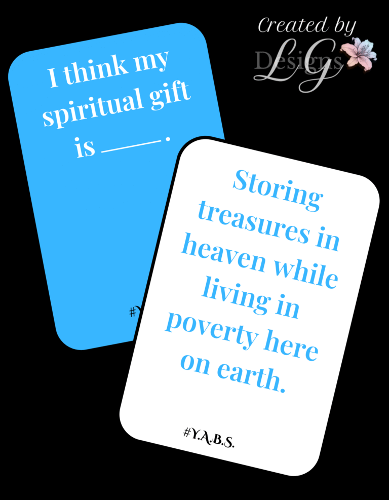
One standout design showcases a playful nod to the group’s camaraderie: an illustration inspired by a Christian card game they enjoyed together, captured on apparel to commemorate a night of laughter, fellowship, and connection.
The overall collection embraces a classic black-and-white palette with bold graphic contrasts and thoughtful typography, creating apparel that feels both purposeful and fashion-forward — merging ministry with modern design.
A playful Y2K-inspired custom tee celebrating the Jonas Brothers’ 2025 tour — blending nostalgic concert style with bold, creative typography and illustration.
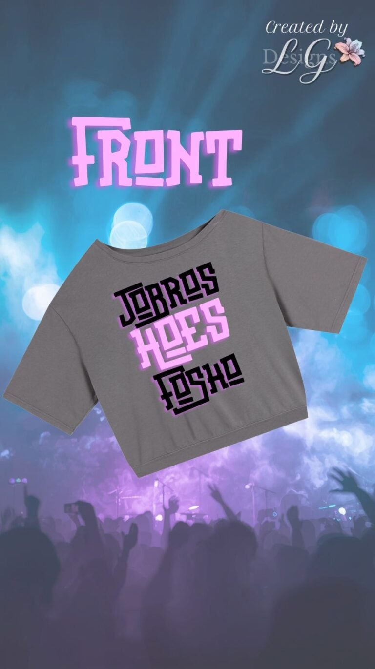
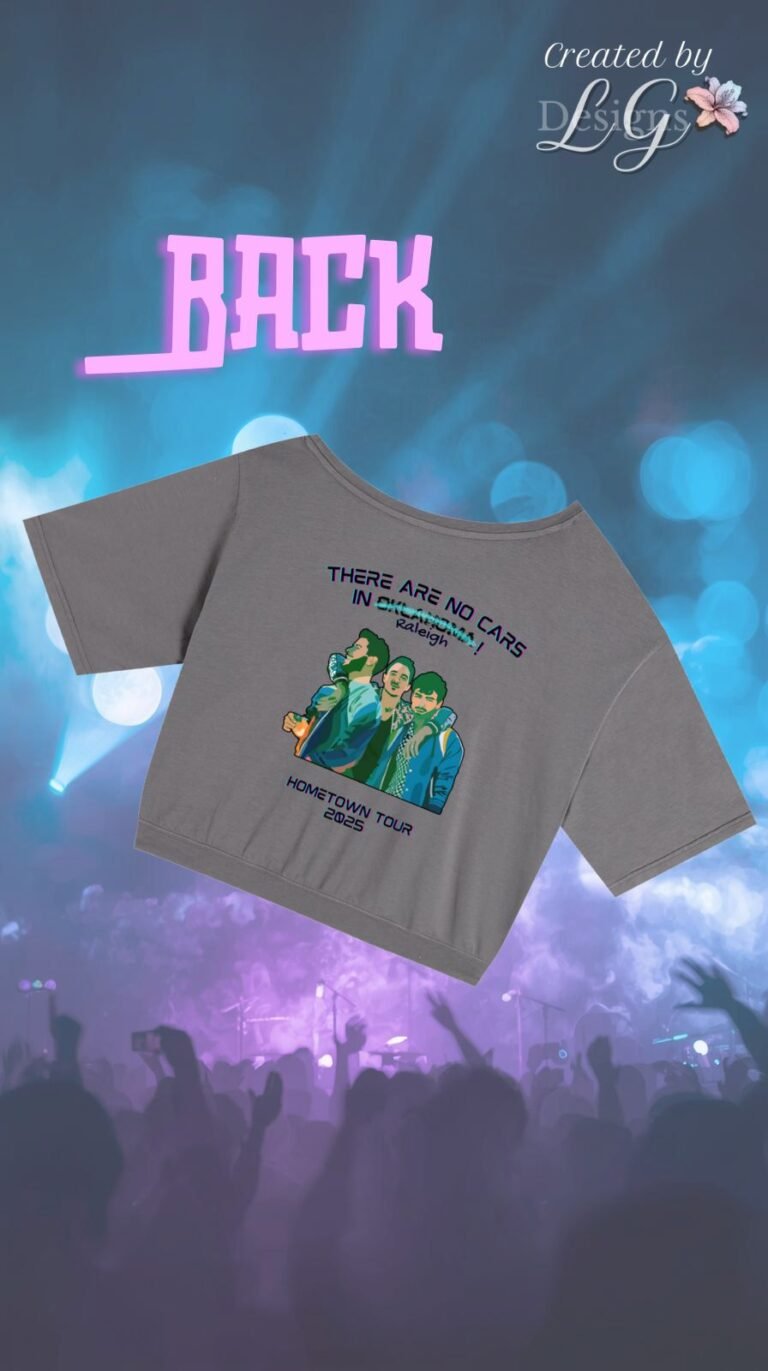
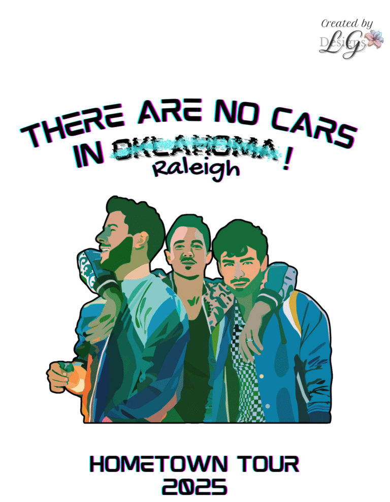
This custom-designed concert tee captures the energy and nostalgia of the Jonas Brothers Hometown Tour 2025. Featuring a playful Y2K-inspired design, the front showcases bold typographic art with a gradient pop aesthetic, while the back highlights a stylized graphic illustration.
Designed to celebrate fandom and fashion, this shirt blends vintage concert tee flair with a modern twist — clean lines, vibrant hues, and playful retro type create a statement piece that’s both collectible and wearable. Crafted with intention and personality, it reflects the joy, connection, and creativity that live music inspires.